In it Dave explores every aspect of comic creation from writing, pencilling, inking, lettering, colouring and design. We have a whole section on cover design so I thought it would be interesting to explore the evolution of How Comics Work's cover and the process involved.
When developing a new non-fiction book it often goes through a process where a mini sample book called a BLAD (Basic Layout And Design) is created first. This gives the publisher and potential co-edition partners and idea of what the book will contain, what the book spreads might look like, etc. Invariably, in my experience, this is a building block and the final product looks nothing like the BLAD. Consequently the cover below was cribbed from Dave's cover of Superman Annual #11. This was never intended to be seen by the public, or for publication, but it meant we had an arresting visual to start with:
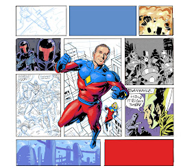
Once the project was green lit we talked with Dave about drawing a new cover and he provided the rough sketches below after discussions with me and the editorial team at Rotovision. It was agreed we wanted flaps and the idea of a superhero on the cover, with the various stages of comic creation reflected, while looking like the whole thing was laid out on Dave's drawing board.
Once this was approved Dave mocked up a quick colour rough for further development. As you can see all the elements of comics were there: Panel boarders, pencils, inks, balloons and colours at various stages. We went with Dave's generic superhero creation as we didn't think we'd get permission, at this stage, to license an actual superhero. Note how the top third of the cover has no major illustrations to allow room for the book logo. Note also that Dave's own creations, The Treatment, The Originals and Give Me Liberty (with Frank Miller) are also featured.
Once the rough sketch was approved Dave added the logo and author credits, just to see if the whole cover balanced, and he tilted the panel borders for added dynamism:
All fully approved he started roughing out the blue pencils (The whole cover was created digitally):
Then he added the detailed pencil layer on top of the roughs:
Finally, once it was inked and coloured, Dave created a rough design for the whole thing including the front and back covers and flaps.
Then we were hit with a bombshell! In these modern days of book publishing the sales and marketing departments hold as much, if not more, control over how books are developed. In many ways this is a double-edged sword. While they may not have the creative eye and know-how for design and editorial, they do know what sells. And, in our case, they knew—from feedback with potential co-edition publishers—that a branded, recognisable superhero would sell more. So it was time to throw the baby out with the bathwater and start again!
A rough design was hastily thrown together which gave us the initial "Dear Lord!" reaction:
The original artwork was drawn by Dave back in around 1984/85 as an in-house DC Comics ad to announce he was starting to work on the Green Lantern comic. Both Dave and I had our reservations, but acquiesced to the knowledge of the Sales & Marketing bods. However, there were two problems: 1) We had to get DC's permission and 2) We had to find the original line art. Fortunately, after much negotiating we resolved problem 1, but neither DC nor Dave had the original artwork! We couldn't just scan the comic as the art wasn't of a high enough quality so we were stuck! Fortunately Dave rarely throws ANYTHING away, and while the original artwork had long since gone, he managed to find a black and white copy of the drawing in his archives. With a little bit of digital cleaning up, he then sent it to his long-term collaborator, colourist and friend Angus McKie (who coloured Martha Washington Goes to War), who then worked his magic on the line work and created the masterpiece below!
So, as with most books, what might appear as a simple and quite obvious cover design—to the reader picking a book up off the shelf for the first time—will almost inevitably have gone through numerous reinventions behind the scenes.
You can ask us any questions you have about this, or anything else, in person at two events we'll be at. The first is the launch signing at Orbital Comics on Wednesday 20th September from 5:30pm onwards. We'll also be discussion Dave's career, the book and anything else you fancy!
And we'll be at Forbidden Planet in Newcastle the following day (Thursday 21st September) signing between 6-7pm. They also have an exhibition of Dave's original art from the book on display for the very first time anywhere!
Hope to see you there!
How Comics Work is published in the UK by Rotovision and is released on 21 September. 192pp $16.99. It is released in the US by Wellfleet Press on 2 October and is $24.99.


No comments:
Post a Comment